
An Analysis on Fake News from Various Media Outlets
Logan OConnell, Kurnal Saini
What is Fake News?
Fake News is false or misleading information presented as news. It often aims to damage the reputation of a person or an entity and is often used to influence the views of followers for political reasons.
Why is misinformation dangerous?
With the election of Donald Trump initiating the most controversial and turbulent presidential term, the existence of fake news has entered the forefront of the political conversation. The spread of misinformation leads to dangerous misconceptions that can virally spread amongst followers and ultimately lead to beliefs and protests that are dangerous to the welfare of entire groups of people. Especially during the era of COVID-19, misinformation about vaccines, the disease, and medical practices have led to backwards protests arguing that vaccines are dangerous, social-distancing is the government trying to control our behaviors, and that the disease itself is just a hoax created by democrats.
How can Data Science assist in identifying misinformation?
We can use machine learning and natural language processing techniques to perform a classification on articles written by various media outlets. In this tutorial, we will following the data science lifecycle and see how we can collect a mass amount of articles from various sources online, and then go through how to clean/process the data. We will then perform some exploratory analysis on the data to better understand patterns in headlines, word count, and sentiment between real and fake news. Next, we will use an existing dataset that extensively labeled articles as real or fake news to build a model that can classify news as real or fake. Finally, we will discuss our findings about fake news through our models and discuss how NLP is making strides for and against misinformation.

Data Collection
The data we collected has two different goals. The articles we obtained through the use of the newspaper package are articles that we would like to eventually be able to classify as real or fake news. The fake or real news dataset from news_article folder was imported from Kaggle and will be used to build our classification model.
Scraped Articles: We scraped articles from various major media outlets such as CNN, Fox News, ABC, NPR, US News, The New York Times, and The Washington Post. We also selected Natural News and the Onion as sources we can confidently classify as fake news, and Harvard Medical Journey which we can confidently classify as a real news media source. The dataset we construct consist of the name of media source, the title of the article, the authors, the article text, keywords analyzed from an nltk package, a summary developed through the nltk package, and the source URL of the article. In total, the CSV generated following the scraping process contains 1621 articles from 10 different sources.
# newspaper is a package that scrapes articles off websites
import newspaper
from newspaper import Article
from newspaper import Source

# natural language toolkit package that consists of many NLP procedures and models
# it is also a dependency for the newspaper NLP operations performed on articles
import nltk

# the data science and manipulation tool that everyone knows and loves
import pandas as pd
# use the newspaper package to create an array of Source objects for each news source
cnn = newspaper.build("https://www.cnn.com/specials/world/coronavirus-outbreak-intl-hnk", memoize_articles=False)
onion = newspaper.build("https://www.theonion.com/tag/coronavirus", memoize_articles=False)
nyt = newspaper.build("https://www.nytimes.com/search?query=covid", memoize_articles=False)
wp = newspaper.build("https://www.washingtonpost.com/newssearch/?query=covid&btn-search=&sort=Relevance&datefilter=All%20Since%202005", memoize_articles=False)
fox = newspaper.build("https://www.foxnews.com/search-results/search?q=covid", memoize_articles=False)
abc = newspaper.build("https://abcnews.go.com/search?searchtext=covid", memoize_articles=False)
npr = newspaper.build("https://www.npr.org/search?query=covid&page=1", memoize_articles=False)
us = newspaper.build("https://www.usnews.com/search/news?q=covid#gsc.tab=0&gsc.q=covid&gsc.page=1", memoize_articles=False)
natural = newspaper.build("https://www.naturalnews.com/search.asp?query=covid", memoize_articles=False)
harvard = newspaper.build("https://www.health.harvard.edu/search?q=covid", memoize_articles=False)
# this function accepts two parameters:
# name: string that provides the name of the media source
# source: a <class 'newspaper.source.Source'> object
# limit: how many articles to return in the dataframe

def create_article_dataframe(name, source, l):

    # if no limit is specified then we exhaust all articles in the source
    limit = float("inf") if l is None else l
    count = 0

    # init dataframe
    articles = pd.DataFrame(columns = ['name', 'title', 'authors', 'text', 'keywords', 'summary', 'published_date', 'source'])

    # arrays use to accumulate data that will be later put in dataframe
    names = []
    titles = []
    authors = []
    text = []
    keywords = []
    summaries = []
    published_dates = []
    sources = []

    for article in source.articles:

        # break loop if count surpassed limit
        if count >= limit: break

        try:
            # downloads HTML for the article
            article.download()
            # parses HTML for fields like title, authors, text, and publish_date
            article.parse()
            # performs NLP analysis to determine properties like keywords and develops a summary field
            article.nlp()
        except:
            continue

        # append values generated above to the array
        names.append(name)
        titles.append(article.title.lower())
        authors.append(article.authors)
        text.append(article.text.lower())
        keywords.append(list(map(lambda x: x.lower(), article.keywords)))
        summaries.append(article.summary.lower())
        published_dates.append(article.publish_date)
        sources.append(article.source_url)

        count += 1

    # build dataframe using the arrays
    articles["name"] = names
    articles["title"] = titles
    articles["authors"] = authors
    articles["text"] = text
    articles["keywords"] = keywords
    articles["summary"] = summaries
    articles["published_date"] = published_dates
    articles["source"] = sources

    return articles
# create dataframes for each media source and its scraped articles
# this process takes a really long time so it's wise to convert the dataframes into a CSV afterwards
cnn_articles = create_article_dataframe("cnn", cnn, 200)
onion_articles = create_article_dataframe("onion", onion, 200)
nyt_articles = create_article_dataframe("nyt", nyt, 200)
wp_articles = create_article_dataframe("wp", wp, 200)
fox_articles = create_article_dataframe("fox", fox, 200)
abc_articles = create_article_dataframe("abc", abc, 200)
us_articles = create_article_dataframe("us", us, 200)
npr_articles = create_article_dataframe("npr", npr, 200)
natural_articles = create_article_dataframe("natural", natural, 200)
harvard_articles = create_article_dataframe("harvard", harvard, 200)
# create a master dataframe with all the articles and convert it to a CSV afterwards
# so we don't have to run the above code continuously
articles = pd.DataFrame(columns = ['name', 'title', 'authors', 'text', 'summary', 'published_date', 'source'])
articles = articles.append(cnn_articles)
articles = articles.append(onion_articles)
articles = articles.append(nyt_articles)
articles = articles.append(wp_articles)
articles = articles.append(fox_articles)
articles = articles.append(abc_articles)
articles = articles.append(us_articles)
articles = articles.append(npr_articles)
articles = articles.append(natural_articles)
articles = articles.append(harvard_articles)

# creates the CSV and uploads it to directory this file is located in
articles.to_csv('news_articles.csv')

# shuffle the data and showcase some of the articles!
articles.sample(frac=1).head()
Fake/Real News Kaggle Dataset: In order to classify the data we scraped above, we need to build a model capable of classifying real news from fake news. We will be used a dataset from Kaggle that has extensively labeled various articles as real or fake in order to build such a model. The dataset has four columns, the title of the article, the article text, the subject the article is about, and the date of release. The dataset consist of 23,481 items for fake news and 21,417 items for real news keeping the set quite balanced.
Please download the CSV from here since it is much too big for github
# read in datasets
fake_news = pd.read_csv("news_dataset/Fake.csv")
real_news = pd.read_csv("news_dataset/True.csv")

# showcase some fake data
fake_news.head()
# showcase some real data
real_news.head()
# a plotting tool born from the sea
import seaborn as sns
# another pretty neat plotting tool
import matplotlib.pyplot as plt

# the data is unlabeled so we provide each dataframe with an appropriate label
fake_news['label'] = "fake"
real_news['label'] = "real"

news_data = pd.concat([fake_news, real_news])

# graph amount of fake vs real news in dataset, like mentioned early, it is quite balanced!
plt.title("Amount of Real News vs Fake News")
sns.countplot(news_data['label'])
plt.show()

We gave the labels above string values so that we could make a nice graph using seaborn, but we should actually assign real news a value of 1 and fake news a value of 0 so we can actually numerically represent them in a classification model in order to make predictions!
# convert the fake and true labels into binary values (0, 1) so we can
# numerically represent them in a classification model to make predictions
fake_news['label'] = 0
real_news['label'] = 1
news_data = pd.concat([fake_news, real_news])
Data Cleansing and Processing
In order to properly integrate the data into a model we need to clean our invalid or null information from the datasets. In addition, when we explore the data we don't want those values to disrupt our visualizations and generate unwanted outliers.
# counts the number of null text fields in the dataframe
# which will allow us to know if we need to remove any rows
def countNullTextFields(df):
    count = 0
    for index, data in df.iterrows():
        if data["text"] is None or data["text"].strip() == "":
            count += 1
    return count
cnn_count = countNullTextFields(cnn_articles)
onion_count = countNullTextFields(onion_articles)
nyt_count = countNullTextFields(nyt_articles)
wp_count = countNullTextFields(wp_articles)
fox_count = countNullTextFields(fox_articles)
abc_count = countNullTextFields(abc_articles)
us_count = countNullTextFields(us_articles)
natural_count = countNullTextFields(natural_articles)
harvard_count = countNullTextFields(harvard_articles)

total = cnn_count + onion_count + nyt_count + wp_count
total += fox_count + abc_count + us_count + natural_count + harvard_count

print("There are a total of ", total, " text fields consisting of NaN values or empty strings.")
# plot the articles and how many null text fields each one has
fig = plt.figure()
ax = fig.add_axes([0,0,1,1])

sources = ['cnn', 'onion', 'nyt', 'wp', 'fox', 'abc', 'us', 'natural', 'harvard']
counts = [cnn_count, onion_count, nyt_count, wp_count,
            fox_count, abc_count, us_count, natural_count, harvard_count]

ax.bar(sources, counts)
plt.show()

According to the graph, we are going to have to remove 48 rows from across the dataframes since they are either null or are simply just an empty string value. It seems that the scraping of data from the onion and fox news may have proved to be especially problematic, lets explore them.
# accepts dataframe and returns new dataframe with rows with null text fields
def keepRowsWithEmptyText(df):
    articles = pd.DataFrame(columns = ['name', 'title', 'authors', 'text', 'keywords', 'summary', 'published_date', 'source'])
    names, titles, authors, text, keywords, summaries, published_dates, sources = [], [], [], [], [], [], [], []

    for index, data in df.iterrows():
        if data["text"] is None or data["text"].strip() == "":
            names.append(data["name"])
            titles.append(data["title"])
            authors.append(data["authors"])
            text.append(data["text"])
            keywords.append(data["keywords"])
            summaries.append(data["summary"])
            published_dates.append(data["published_date"])
            sources.append(data["source"])

    articles["name"] = names
    articles["title"] = titles
    articles["authors"] = authors
    articles["text"] = text
    articles["keywords"] = keywords
    articles["summary"] = summaries
    articles["published_date"] = published_dates
    articles["source"] = sources
    return articles

# lets view the null onion articles
flagged_onion_articles = keepRowsWithEmptyText(onion_articles)
flagged_onion_articles.head()
# lets view the null fox articles
flagged_fox_articles = keepRowsWithEmptyText(fox_articles)
flagged_fox_articles.head()
# lets view the null cnn articles
flagged_cnn_articles = keepRowsWithEmptyText(cnn_articles)
flagged_cnn_articles.head()
A pattern has definitely emerged based on just the head of all these dataframes in that these articles do not have body text and consist of only a headline. Headlines can also qualify as being fake news, and actually play in a major role in deceiving readers with flashy text. Lets add a new check into the countNullTextFields function that also checks to see if the title is empty or null.
# lets view the null abc articles
flagged_abc_articles = keepRowsWithEmptyText(abc_articles)
flagged_abc_articles.head()
# counts the number of null text and title fields in the dataframe
# which will allow us to know if we need to remove any rows
def countNullTextAndTitleFields(df):
    count = 0
    for index, data in df.iterrows():
        if data["text"] is None or data["text"].strip() == "":
            if data["title"] is None or data["title"].strip() == "":
                count += 1
    return count
# count the rows with null text and title fields

cnn_count = countNullTextAndTitleFields(cnn_articles)
print("There are a total of ", cnn_count, " text fields consisting of NaN values or empty strings in CNN.")
onion_count = countNullTextAndTitleFields(onion_articles)
print("There are a total of ", onion_count, " text fields consisting of NaN values or empty strings in ONION.")
fox_count = countNullTextAndTitleFields(fox_articles)
print("There are a total of ", fox_count, " text fields consisting of NaN values or empty strings in FOX.")
abc_count = countNullTextAndTitleFields(abc_articles)
print("There are a total of ", abc_count, " text fields consisting of NaN values or empty strings in ABC.")
Okay awesome so there are actually not any null or empty string text and title fields in any row so we can happily clean all the text in each of the articles to standardize the style of the data.
import string
from nltk.corpus import stopwords
stop = stopwords.words('english')

# we should combine titles and text for simplicity when doing the classification
# we should also remove punctuation and lowercase all the letters
# we should also remove all stopwords from the text
# this is all to normalize the sentence structure in order
# to prevent any unnecessary data from being analyzed

def punctuation_removal(text):
    all_list = [char for char in text if char not in [*string.punctuation]]
    clean_str = text.replace('[^a-zA-Z | ^\s]+', '')
    return clean_str

def remove_stop_words(text):
    return ' '.join([word for word in text.split() if word not in (stop)])

def cleanText(df):
    df['text'] = df['title'] + ' ' + df['text']
    df['text'] = df['text'].str.replace('[^a-zA-Z | ^\s]+', '')
    df['text'] = df['text'].str.lower()
    df['text'] = df['text'].apply(remove_stop_words)
    return df
# clean the text of all the articles
cnn_articles = cleanText(cnn_articles)
onion_articles = cleanText(onion_articles)
nyt_articles = cleanText(nyt_articles)
wp_articles = cleanText(wp_articles)
fox_articles = cleanText(fox_articles)
abc_articles = cleanText(abc_articles)
us_articles = cleanText(us_articles)
natural_articles = cleanText(natural_articles)
harvard_articles = cleanText(harvard_articles)
Let's do the same type of cleaning for the Kaggle Fake/Real News dataset also.
count = countNullTextAndTitleFields(news_data)
print("There are a total of", count, " text fields consisting of NaN values or empty strings.")
Go figure, a dataset provided to us by Kaggle passed the null and empty string verification. This is great news though since we can now move away from data cleansing and focus on doing some extra processing on data fields to prepare it .
# we can clean the kaggle dataset also now.
# due to the nature of the Kaggle dataframe being immutable
# we have to create a new dataframe for the cleaned text

def cleanText(df):
    articles = pd.DataFrame(columns = ['title', 'text', 'subject', 'date', 'label'])
    titles, texts, subjects, dates, labels = [], [], [], [], []
    for index, data in df.iterrows():

        data["text"] = data["title"] + " " + data["text"]
        data["text"] = punctuation_removal(data["text"])
        data["text"] = remove_stop_words(data["text"])

        titles.append(data["title"])
        texts.append(data["text"])
        subjects.append(data["subject"])
        dates.append(data["date"])
        labels.append(data["label"])

    articles["title"] = titles
    articles["text"] = texts
    articles["subject"] = subjects
    articles["date"] = dates
    articles["label"] = labels

    return articles

real_news = cleanText(real_news)
Exploratory Analysis and Data Visualization
We are now going to explore the two sets of data we have in order to make some observations about the nature of fake news versus real news.
# stopwords are words which are filtered out before or after processing NLP
from nltk.corpus import stopwords

# wordcloud visualization package
from wordcloud import WordCloud

# this function builds a wordcloud for a given set of data
def show_wordcloud(data, title=None):
    # build wordcloud
    wordcloud = WordCloud(
        background_color='white',
        stopwords=stopwords.words('english'),
        max_words=200,
        max_font_size=40,
        scale=3
    ).generate(str(data))

    # plot wordcloud
    fig = plt.figure(1, figsize=(12, 12))
    plt.axis('off')
    if title:
        fig.suptitle(title, fontsize=20)
        fig.subplots_adjust(top=2.3)
    plt.imshow(wordcloud)
    plt.show()
# wordcloud showcasing prominent words in real news
show_wordcloud("".join(news_data[news_data["label"] == 1].text))

From the wordcloud we can see that prominent words in real news include Trump, Russia, government, and North Korea. These are all prominent news topics in present time!
# wordcloud showcasing prominent words in fake news
show_wordcloud("".join(news_data[news_data["label"] == 0].text))

From the fake news wordcloud we can see that Donald Trump is even more prominent (haha). Hillary clinton (go figure), republican, and obama are also pretty common, and from knowledge of politics, we do know that these are quite polarizing topics in politics.
# re-input the clean text function from earlier
def cleanText(df):
    df['text'] = df['title'] + ' ' + df['text']
    df['text'] = df['text'].str.replace('[^a-zA-Z | ^\s]+', '')
    df['text'] = df['text'].str.lower()
    df['text'] = df['text'].apply(remove_stop_words)
    return df

# This method joins all of the text for either real or fake news, and then performs a word frequency count
# on the corpus. This gives us a dataframe comprised of the total word frequencies.
def createFrequencyDistForLabel(label):
    # Join texts togther
    words_arr = ''.join(news_data_copy[news_data_copy['label'] == label].text)

    # Tokenize with NLTK
    words = nltk.tokenize.word_tokenize(words_arr)

    # Get frequency distribution
    fdist = nltk.FreqDist(words)

    # Remove stopwords from distibution
    stopwords = nltk.corpus.stopwords.words('english')
    filtered_word_freq = dict((word, fdist[word]) for word in fdist if word not in stopwords)

    # Create and return dataframe
    df_freq = pd.DataFrame({'Word': list(filtered_word_freq.keys()), 'Count': list(filtered_word_freq.values())})

    return df_freq
# Create a copy of the dataset since we will be altering it directly
news_data_copy = news_data
news_data_copy = cleanText(news_data_copy)
# Generate word frequency for real news
df_freq_real_news = createFrequencyDistForLabel(1)

# Get 20 most-used words
df_freq_real_news_plot = df_freq_real_news.nlargest(20, columns='Count')

# Generate word frequency for fake news
df_freq_fake_news = createFrequencyDistForLabel(0)

# Get 20 most-used words
df_freq_fake_news_plot = df_freq_fake_news.nlargest(20, columns='Count')

# Plotting
fig, ax = plt.subplots(1, 2, figsize=(16, 6))

g = sns.barplot(data=df_freq_real_news_plot, y='Word', x='Count', ax=ax[0])
h = sns.barplot(data=df_freq_fake_news_plot, y='Word', x='Count', ax=ax[1])

g.set_title('Word Frequency of Real News')
h.set_title('Word Frequency of Fake News')

sns.despine()

Analyzing Frequency of Words in Real and Fake News
From this word frequency graph, we can see that there are many similar words used between articles that are real and fake news from the dataset. Words like "trump", "president", "said", and "us" all expectedly appear both graphs. The word "trump" however appears much more in the fake news, with around 50,000 instances in the real news and 80,000 in the fake news. "hillary" is also in the fake news many times, leading us to believe that these instances may have been tied to the 2016 election.
import math
import numpy as np
from nltk.sentiment.vader import SentimentIntensityAnalyzer as SIA

# This method will generate polarity scores for either real or fake news headlines, and return a dataframe
# comprised of these polarity scores.
def createSentimentAnalysisForLabel(label):
    sia = SIA()
    results = []

    # Get polarity score for each headline
    for line in news_data_copy[news_data_copy['label'] == label].title:
        pol_score = sia.polarity_scores(line)
        pol_score['headline'] = line
        results.append(pol_score)

    # Create dataframe
    sent_df = pd.DataFrame.from_records(results)
    sent_df.head()

    # Label each row based on sentiment's compound polarity
    sent_df['label'] = 0
    sent_df.loc[sent_df['compound'] > 0.2, 'label'] = 1
    sent_df.loc[sent_df['compound'] < -0.2, 'label'] = -1
    sent_df.head()

    return sent_df
# Generate sentiment analysis for real news
sent_df_real_news = createSentimentAnalysisForLabel(1)

# Generate sentiment analysis for fake news
sent_df_fake_news = createSentimentAnalysisForLabel(0)

# Plotting
fig, ax = plt.subplots(1, 2, figsize=(16, 6))

counts1 = sent_df_real_news.label.value_counts(normalize=True) * 100
counts2 = sent_df_fake_news.label.value_counts(normalize=True) * 100

sns.barplot(x=counts1.index, y=counts1, ax=ax[0])
sns.barplot(x=counts2.index, y=counts2, ax=ax[1])

ax[0].set_xticklabels(['Negative', 'Neutral', 'Positive'])
ax[0].set_ylabel('Sentiment Polarity')
ax[0].set_ylabel('Percentage')
ax[0].set_title('Sentiment Polarity of Real News')

ax[1].set_xticklabels(['Negative', 'Neutral', 'Positive'])
ax[1].set_ylabel('Sentiment Polarity')
ax[1].set_ylabel('Percentage')
ax[1].set_title('Sentiment Polarity of Fake News')

plt.show()

Exploring Sentiment Polarity of Real and Fake News
After performing natural language processing on the headlines of both real and fake news, we graphed the sentiment polarity of each group along with their percentage of the entire group. From these graphs, we can see that in the real news data, almost 50% of the headlines were linguistically neutral. Neutral headlines only made up around 30% of headlines in the fake news group, yet close to 50% of the fake news headlines were reported as negative. This could potentially be from fake news being more "fear-mongering".
# This method generates the sentiment polarity scores for a group of articles.
def createSentimentAnalysisForArticles(articles):
    sia = SIA()
    results = []

    # Get polarity score for each headline
    for line in articles.title:
        pol_score = sia.polarity_scores(line)
        pol_score['headline'] = line
        results.append(pol_score)

    # Create and return dataframe
    sent_df = pd.DataFrame.from_records(results)

    return sent_df
# Perform sentiment analysis on articles from The Onion
sent_df_onion = createSentimentAnalysisForArticles(onion_articles)
sent_df_onion.index.name = 'index'
sent_df_onion['label'] = 'Onion'

# Perform sentiment analysis on articles from CNN
sent_df_cnn = createSentimentAnalysisForArticles(cnn_articles)
sent_df_cnn.index.name = 'index'
sent_df_cnn['label'] = 'CNN'

# Perform sentiment analysis on articles from Fox
sent_df_fox = createSentimentAnalysisForArticles(fox_articles)
sent_df_fox.index.name = 'index'
sent_df_fox['label'] = 'Fox'

# Concatenate all DFs together and drop the neutral articles
sent_df = pd.concat([sent_df_onion, sent_df_cnn, sent_df_fox], sort=False)
sent_df = sent_df[sent_df['neu'] != 1]
sent_df['Source'] = sent_df['label']
sent_df = sent_df.drop(['label'], axis=1)
sent_df.head(10)
# Plotting
g = sns.FacetGrid(sent_df, hue='Source', height=6, aspect=2)
g = g.map(sns.distplot, 'compound', hist=False, rug=True)

g.set(title='Sentiment Polarity of Various News Outlets', xlabel='Sentiment Polarity', ylabel='Density')

g.add_legend()

plt.show()

Exploring Sentiment Polarity of Various News Outlets
We performed sentiment analysis here on articles from The Onion, CNN, and Fox. Graphing the polarity of these articles, we can see that real news tends to contain a more negative sentiment, while fake news like The Onion is generally more positive.
# This method simply adds a field to a dataframe containing the length of the text field.
def addLengthFieldToDF(df):
    df['length'] = 0

    for index, data in df.iterrows():
        df.loc[index, 'length'] = len(data['text'])

    return df
# Add length field to articles DF

articles = addLengthFieldToDF(articles)

# Plotting
fig, ax = plt.subplots(figsize=(12, 6))

g = sns.boxplot(x='length', y='name', data=articles, showfliers=False, ax=ax)

g.set(title='Word Count of Various Sources', xlabel='Length', ylabel='Source')

plt.show()

Looking at Word Count of Various Sources
From this graph, we can see that nearly all of these major news sources have the same word count range, generally between 500 and 1,500 words. The New York Times and Natural News are the outliers, with a trend between around 500 and 3,000 words per article, with much larger upper outliers. Overall, this graph helps us see that most of the news sources we are performing NLP on will have the same amount of articles with mostly the same word count.
Model Creation and Analysis
Now for the spicy part. Now that all of our data is organized and we have been able to gain some insight on the nature of the data through some exploratory analysis.
Goal
The goal of our model is to be able to predict whether an article should be treated as real news or fake news so we can notify readers about being wary for misinformation in a given article.
Vectorization and Transformation
We will need to first vectorize the text so that the data becomes numerically represented in the sense that it can be usable in a classification algorithmn. We will also need to do transformation in an attempt to get better performance for our models
Count Vectorizer
The count vectorizer tokenizes a collection of documents in order to build a vocabulary of unique words. In essence, it converts a collection of text documents into a matrix of token counts.
TF-IDF Transformer
Some words do not have any meaning like 'the', 'and', and 'be' so we need to eliminate them in order to supply the model with mostly meaningful words. TF-IDF or Term Frequency-Inverse Document Frequency is used to remove such words. Inverse document frequency reduces the scores of the words that appear too much across all the documents. In other words, TF-IDF gives frequency score to words by highlighting the ones which are more frequent in a document, but not across documents. The TF-IDF transforms the vector using the new TF-IDF scores in order to diminish the strength of extremely common words in the model.
Binary Classifiers
There are many different ways to perform binary classification. I want to try three classification algorithms in this tutorial: Logistic Regression, Support Vector Machine, and a Decision Tree.
Logistic Regression
This classification method creates a weight vector(s) that correspond to each attribute used as a predictor. It then uses the dot product of that weight vector and the observation as an argument to a sigmoid function. Since the sigmoid function has a range between 0 and 1, the output works well in classifying binaries (real or fake news).
Support Vector Machine
This classification model work by finding a hyperplane in an n-dimensional space that is defined by our attributes (vectorized text) that maximizes the distance between the two closest vectors in two different classes. Using the calculated plane, we can see if an article lies below it, indicating fake news, or above it, indicating real news.

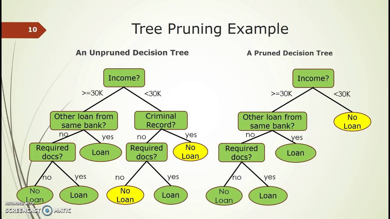
Decision Tree
This model works by using entropy, a measure of how homogenous data is, and information gain, the decrease in entropy after the dataset is split on an attribute. The decision tree partitions data into subsets to disperse across the tree and then prunes the tree by combining the adjacent nodes that have low information gain in order to reduce its size (since simpler trees prevent overfitting). The node with the largest information gain is chosen as the answer at the end of the algorithm. It becomes almost like a flow chart!
Measuring Performance
Accuracy
This is the ratio of the number of correct predictions to the total number of predictions. It is only a good metric if the data is balanced, and in our scenario, the Kaggle dataset was proven to be balanced.
Confusion Matrix
This compares predicted values to the actual values, and measures them in four different ways in order to evaluate performance.
True Positive: predicted and actual values are the same, and the value was real news
True Negative: predicted and actual values are the same, and the value was fake news
False Positive: the case in which the value was predicted as real news but it was actually fake
False Negative: the case in which the value was predicted as fake news but it was actually real
from sklearn.model_selection import train_test_split
from sklearn.utils import shuffle
from sklearn.svm import LinearSVC
from sklearn.linear_model import LogisticRegression
from sklearn.tree import DecisionTreeClassifier
from sklearn.feature_extraction.text import CountVectorizer
from sklearn.feature_extraction.text import TfidfTransformer
from sklearn.pipeline import Pipeline
from sklearn.metrics import accuracy_score
import sklearn.metrics as metrics
import numpy as np

from mlxtend.plotting import plot_confusion_matrix
from sklearn.metrics import confusion_matrix
# drop the index column
news_data = news_data.reset_index(drop=True)
# prevents any bias from occurring in the model
news_data = shuffle(news_data)
# make training and testing data sets using sklearn
x_train, x_test, y_train, y_test = train_test_split(news_data['text'], news_data['label'], test_size=0.2, random_state=42)
# our two classes
classes = ["Fake", "Real"]

# the pipeline tool allows us to neatly perform operations on a given dataset without too much extra typing
pipe = Pipeline([
    ('vect', CountVectorizer()),
    ('tfidf', TfidfTransformer()),
    ('model', LogisticRegression())
])

model_log = pipe.fit(x_train, y_train)
pred_log = model_log.predict(x_test)

accuracy_score = metrics.accuracy_score(y_test, pred_log)
print("accuracy: %0.3f" % (accuracy_score * 100) + "%")
cm = confusion_matrix(y_test, pred_log, labels=[0, 1])
plot_confusion_matrix(conf_mat=cm, colorbar=True)
tick_marks = np.arange(len(classes))
plt.xticks(tick_marks, classes, rotation=45)
plt.yticks(tick_marks, classes)
plt.show()

Awesome, so Logistic Regression is 98.931% accurate with 96 misidentifications.
pipe = Pipeline([
    ('vect', CountVectorizer()),
    ('tfidf', TfidfTransformer()),
    ('model', LinearSVC())
])

model_svc = pipe.fit(x_train, y_train)
pred_svc = model_svc.predict(x_test)

accuracy_score = metrics.accuracy_score(y_test, pred_svc)
print("accuracy: %0.3f" % (accuracy_score * 100) + "%")
cm = confusion_matrix(y_test, pred_svc, labels=[0, 1])
plot_confusion_matrix(conf_mat=cm, colorbar=True)
tick_marks = np.arange(len(classes))
plt.xticks(tick_marks, classes, rotation=45)
plt.yticks(tick_marks, classes)
plt.show()

Nice, LinearSVC is 99.644% accurate with 32 misidentifications.
pipe = Pipeline([
    ('vect', CountVectorizer()),
    ('tfidf', TfidfTransformer()),
    ('model', DecisionTreeClassifier(criterion='entropy'))
])

model_tree = pipe.fit(x_train, y_train)
pred_tree = model_tree.predict(x_test)

accuracy_score = metrics.accuracy_score(y_test, pred_tree)
print("accuracy: %0.3f" % (accuracy_score * 100) + "%")
cm = confusion_matrix(y_test, pred_tree, labels=[0, 1])
plot_confusion_matrix(conf_mat=cm, colorbar=True)
tick_marks = np.arange(len(classes))
plt.xticks(tick_marks, classes, rotation=45)
plt.yticks(tick_marks, classes)
plt.show()

The Entropy Decision Tree is 99.772% accurate with 25 misidentifications. It performed the best by the slightest margin, but it is much easier to state that all the classification models performed similarly and spectacularly likewise!
Running our New Model on Scraped Articles
Lets give our model a spin on our scraped articles to see how well it does on new data. We will stick with the decision tree algorithm since it technically performed best.
# counts the number of zeros or ones in an array and returns it
def count(predictions, val):
    count = 0
    for pred in predictions:
        if pred == val:
            count += 1
    return count

# predict natural news
natural_news_text = natural_articles.iloc[ : , 3]
pred_natural = model_tree.predict(natural_news_text)

# predict the onion
onion_news_text = onion_articles.iloc[ : , 3]
pred_onion = model_tree.predict(onion_news_text)

# graph data generation
labels = ['Natural News', 'The Onion']
fake_count = [count(pred_natural, 0), count(pred_onion, 0)]
real_count = [count(pred_natural, 1), count(pred_onion, 1)]

# styling
x = np.arange(len(labels))  # the label locations
width = 0.35  # the width of the bars

fig, ax = plt.subplots()
rects1 = ax.bar(x - width/2, fake_count, width, label='Fake')
rects2 = ax.bar(x + width/2, real_count, width, label='Real')

# Add some text for labels, title and custom x-axis tick labels, etc.
ax.set_ylabel('Count')
ax.set_xlabel('Media Source')
ax.set_title('Counts by Media Source')
ax.set_xticks(x)
ax.set_xticklabels(labels)
ax.legend()
plt.show()

This is amazing, Natural News is a conspiracy theory news source and The Onion is purely satirical news, so it is great news that the classification algorithm essentially labeled almost all of them as fake news!
# predict cnn news
cnn_news_text = cnn_articles.iloc[ : , 3]
pred_cnn = model_tree.predict(cnn_news_text)

# predict nyt news
nyt_news_text = nyt_articles.iloc[ : , 3]
pred_nyt = model_tree.predict(nyt_news_text)

# predict wp news
wp_news_text = wp_articles.iloc[ : , 3]
pred_wp = model_tree.predict(wp_news_text)

# predict fox news
fox_news_text = fox_articles.iloc[ : , 3]
pred_fox = model_tree.predict(fox_news_text)

# predict abc news
abc_news_text = abc_articles.iloc[ : , 3]
pred_abc = model_tree.predict(abc_news_text)

# predict npr news
npr_news_text = npr_articles.iloc[ : , 3]
pred_npr = model_tree.predict(npr_news_text)

# predict us news
us_news_text = us_articles.iloc[ : , 3]
pred_us = model_tree.predict(us_news_text)

# graph data generation
labels = ['CNN', 'NYT', 'WP', 'FOX', 'ABC', 'NPR', 'US']
fake_count = [count(pred_cnn, 0), count(pred_nyt, 0), count(pred_wp, 0),
             count(pred_fox, 0), count(pred_abc, 0), count(pred_npr, 0), count(pred_us, 0)]
real_count = [count(pred_cnn, 1), count(pred_nyt, 1), count(pred_wp, 1),
             count(pred_fox, 1), count(pred_abc, 1), count(pred_npr, 1), count(pred_us, 1)]

# styling
x = np.arange(len(labels))  # the label locations
width = 0.35  # the width of the bars

fig, ax = plt.subplots()
rects1 = ax.bar(x - width/2, fake_count, width, label='Fake')
rects2 = ax.bar(x + width/2, real_count, width, label='Real')

# Add some text for labels, title and custom x-axis tick labels, etc.
ax.set_ylabel('Count')
ax.set_xlabel('Media Source')
ax.set_title('Counts by Media Source (Decision Tree)')
ax.set_xticks(x)
ax.set_xticklabels(labels)
ax.legend()
plt.show()

Not so great news though, the rest of the articles seem to be heavily skewed as fake. This is alarming as these are quite prominent news sources. It is quite likely that the Decision Tree classification overfitted the Kaggle data, a common pitfall for Decision Trees. Let's try the other models to see if we see anything different.
# predict cnn news
cnn_news_text = cnn_articles.iloc[ : , 3]
pred_cnn = model_svc.predict(cnn_news_text)

# predict nyt news
nyt_news_text = nyt_articles.iloc[ : , 3]
pred_nyt = model_svc.predict(nyt_news_text)

# predict wp news
wp_news_text = wp_articles.iloc[ : , 3]
pred_wp = model_svc.predict(wp_news_text)

# predict fox news
fox_news_text = fox_articles.iloc[ : , 3]
pred_fox = model_svc.predict(fox_news_text)

# predict abc news
abc_news_text = abc_articles.iloc[ : , 3]
pred_abc = model_svc.predict(abc_news_text)

# predict npr news
npr_news_text = npr_articles.iloc[ : , 3]
pred_npr = model_svc.predict(npr_news_text)

# predict us news
us_news_text = us_articles.iloc[ : , 3]
pred_us = model_svc.predict(us_news_text)

# graph data generation
labels = ['CNN', 'NYT', 'WP', 'FOX', 'ABC', 'NPR', 'US']
fake_count = [count(pred_cnn, 0), count(pred_nyt, 0), count(pred_wp, 0),
             count(pred_fox, 0), count(pred_abc, 0), count(pred_npr, 0), count(pred_us, 0)]
real_count = [count(pred_cnn, 1), count(pred_nyt, 1), count(pred_wp, 1),
             count(pred_fox, 1), count(pred_abc, 1), count(pred_npr, 1), count(pred_us, 1)]

# styling
x = np.arange(len(labels))  # the label locations
width = 0.35  # the width of the bars

fig, ax = plt.subplots()
rects1 = ax.bar(x - width/2, fake_count, width, label='Fake')
rects2 = ax.bar(x + width/2, real_count, width, label='Real')

# Add some text for labels, title and custom x-axis tick labels, etc.
ax.set_ylabel('Count')
ax.set_xlabel('Media Source')
ax.set_title('Counts by Media Source')
ax.set_xticks(x)
ax.set_xticklabels(labels)
ax.legend()
plt.show()

LinearSVC seems have a better ability to fit real articles, but it is still heavily skewed to fake articles, which is a concerning phenomenon.
# predict cnn news
cnn_news_text = cnn_articles.iloc[ : , 3]
pred_cnn = model_log.predict(cnn_news_text)

# predict nyt news
nyt_news_text = nyt_articles.iloc[ : , 3]
pred_nyt = model_log.predict(nyt_news_text)

# predict wp news
wp_news_text = wp_articles.iloc[ : , 3]
pred_wp = model_log.predict(wp_news_text)

# predict fox news
fox_news_text = fox_articles.iloc[ : , 3]
pred_fox = model_log.predict(fox_news_text)

# predict abc news
abc_news_text = abc_articles.iloc[ : , 3]
pred_abc = model_log.predict(abc_news_text)

# predict npr news
npr_news_text = npr_articles.iloc[ : , 3]
pred_npr = model_log.predict(npr_news_text)

# predict us news
us_news_text = us_articles.iloc[ : , 3]
pred_us = model_log.predict(us_news_text)

# graph data generation
labels = ['CNN', 'NYT', 'WP', 'FOX', 'ABC', 'NPR', 'US']
fake_count = [count(pred_cnn, 0), count(pred_nyt, 0), count(pred_wp, 0),
             count(pred_fox, 0), count(pred_abc, 0), count(pred_npr, 0), count(pred_us, 0)]
real_count = [count(pred_cnn, 1), count(pred_nyt, 1), count(pred_wp, 1),
             count(pred_fox, 1), count(pred_abc, 1), count(pred_npr, 1), count(pred_us, 1)]

# styling
x = np.arange(len(labels))  # the label locations
width = 0.35  # the width of the bars

fig, ax = plt.subplots()
rects1 = ax.bar(x - width/2, fake_count, width, label='Fake')
rects2 = ax.bar(x + width/2, real_count, width, label='Real')

# Add some text for labels, title and custom x-axis tick labels, etc.
ax.set_ylabel('Count')
ax.set_xlabel('Media Source')
ax.set_title('Counts by Media Source')
ax.set_xticks(x)
ax.set_xticklabels(labels)
ax.legend()
plt.show()

Logistic Regression classified about the same fake to real ratio as the Linear AVC. Based on our findings though, we can assume one of the three following statements. To reiterate, it is possible that the classification algorithms overfitted the Kaggle data leading to new data struggling to get identified correctly. Maybe, there was too much noise in the data still and the classification turned out sour. Finally, one could also assume that the distinction between fake news and real news treads a thin line, and further in depth analysis and advanced NLP tricks will be needed in order to identify the distinction.
One final train of thought could be that the news articles actually contained some misinformation (a possibility), and that we should always be wary reading any news source (always a good idea).
As an edge case, lets try running the classification on articles from Harvard, which we can assume to be mostly real news and not fake news since they are backed by real science.
# harvard
harvard_news_text = harvard_articles.iloc[ : , 3]
pred_harvard = model_svc.predict(harvard_news_text)
plt.bar(["Fake", "Real"], [count(pred_harvard, 0), count(pred_harvard, 1)])
plt.show()

Unfortunate, but the classification model failed to find most of the harvard articles to be real news. It is likely that the scientific rhetoric of these articles is so vastly different from that in the Kaggle dataset that the NLP algorithm could not classify it as real.
Conclusion
In this tutorial, we were able to scrape news articles using the newspaper package in hope of classifying them later on through the development of a model built from a Kaggle dataset on real/fake news. We went through the process of cleaning and processing the data in order to prepare them for the machine learning models, and we performed exploratory analysis in order to identify characteristics of the dataset like sentiment, word count, and keyword analysis. We then used Logistic Regression, Linear SVC, and Decision Trees to train a model to predict whether an article is fake or real news with great success for the Kaggle Data. However, when we tried applying it to actual data the results were always skewed to be fake. This could have been because the models were overfitted, the models were trained with too much noise, or perhaps because the rhetoric of fake and real news is actually really similar. There is also even the chance that the articles labeled as fake actually contained some misinformation which is a possible occurrence, and the model shows that we should always be wary when reading any news article. Overall though, we can see that NLP is a powerful tool in addressing the fake news problem in society, and there exists even more powerful and advanced models in the real world that can pin down on misinformation with fierce accuracy.
Beware though, NLP is also part of the problem. Read more about OpenAI's GPT-2 model which has been in the news for actually using NLP to generate fake news indistinguisable from human written text.
Read more about it at: OpenAI's GPT-2 Model